The Comparison Conundrum
Redesigning a frustrating insurance tool into something people actually wanted to use.
Role
Lead UX Designer
Timeline
6 months
Platform
Responsive Web App
🧠 The Mess We Were Untangling
The old "Compare Plans" page was practically unusable. Outdated data, clunky layout, and zero responsiveness made it useless — especially on mobile, where many of our users were shopping. Even brokers, our most knowledgeable users, avoided it entirely. Instead, they built their own spreadsheets and workarounds. We needed to create a better experience and fast!
💡 Our Big Idea
Make plan comparison simple, not overwhelming.
Health plan data is inherently complex, so instead of reducing information, we focused on presenting it in a way that’s digestible across devices. Our vision: a table-style layout that adapts beautifully to mobile, with features like pinning, collapsible cards, and accessible interactions that empower users to confidently choose the right plan.
✨ What We Built
A redesigned Compare Plans page that balances data density with clarity.
Key improvements included:
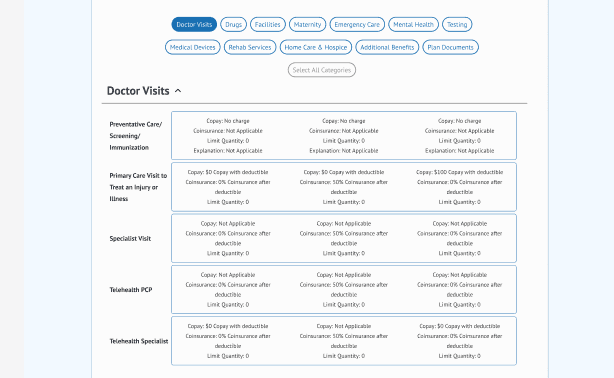
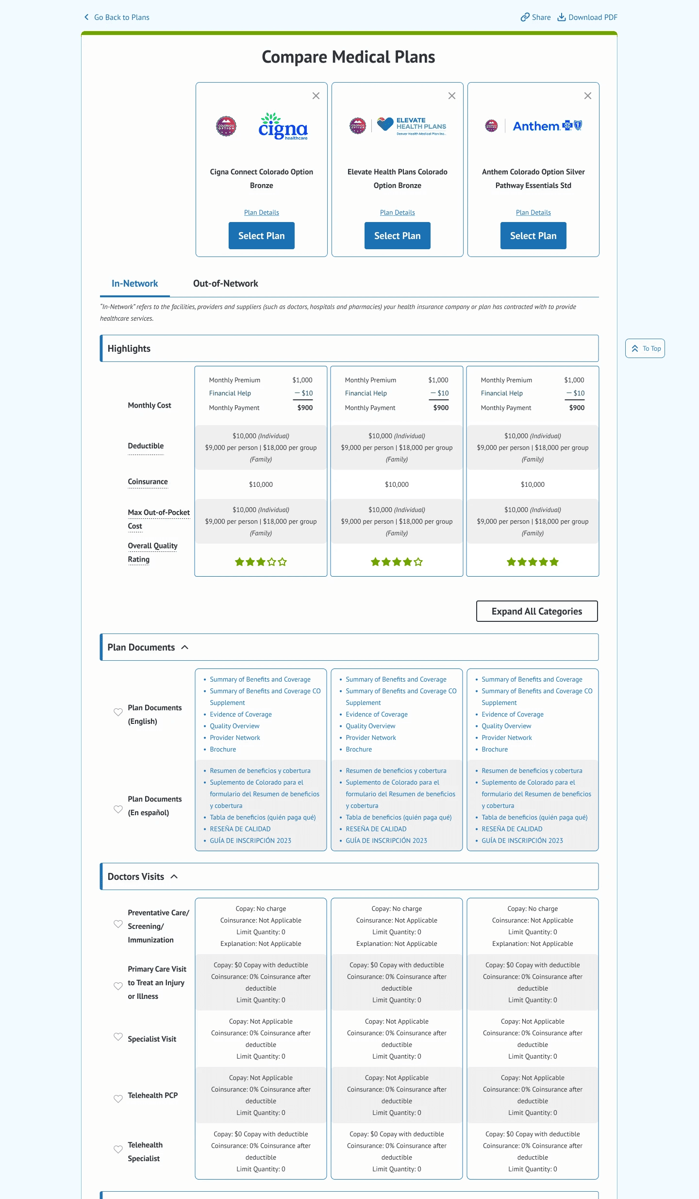
A fully responsive data table that works on mobile (a massive challenge).
Interactive features like pinning key info and expanding/collapsing sections.
A visual and structural system that supports up-to-date data and reduces cognitive overload.
New UI components custom-built by developers based on our design specs.
We also designed with brokers in mind, providing the clarity and detail they need to support customers, directly in the tool.
🧩 Our Challenges
Unclear direction early on meant I spent a lot of time dreaming without boundaries. Eventually, scope, time, and dev feasibility reeled things back in.
Mobile-friendly data design is extremely hard. We tested multiple layouts to find one that worked.
Communication gaps with devs required a lot of explanation and documentation. Fortunately, we built strong relationships that paid off.
Designing while still learning how to define scope taught me how important early alignment is.
👩💻 My Role
As the lead designer, I owned the end-to-end UX process, from discovery to delivery:
Conducted competitive analysis to benchmark best-in-class comparison tools.
Designed and iterated on multiple layout variations, especially for mobile.
Partnered with UX research to test early ideas and gather usability insights.
Facilitated feedback sessions with our power users and incorporated their input.
Worked closely with devs to co-create new components and ensure implementation matched intent.
Advocated for user needs and feasibility tradeoffs during scope negotiations with product.
📈 The Results
Overwhelmingly positive feedback from users and brokers after launch.
Increased NPS scores and positive feedback tied to shopping experience.
Highest enrollment numbers to date in the first year the new compare tool launched.
(While many factors contribute to that, making it easier to compare and feel confident in a choice played a big role.)
👩🎓 What I Learned
Iterating isn’t the enemy—disorganization is. Keeping design work tidy and trackable is critical when the solution takes months to surface.
Kickoff conversations matter. Asking, “What are we solving and what do you need from me?” could’ve saved months of misaligned effort.
Strong cross-functional partnerships are gold. Because I built trust with devs, they were willing to build net-new functionality like pinning, just to get the experience right.
Research keeps you grounded. Sitting in on user testing gave me a clear filter for every design decision.
🧰 Skills This Project Showcases
✅ Transforming complexity into clarity across screen sizes
✅ Translating user insights into structured, intuitive design
✅ Collaborating with developers to push UI possibilities
✅ Working closely with brokers and users to shape features that matter
✅ Designing flexibly under changing scope and tight technical constraints
✅ Bringing order to long, iterative design processes
📎Artifacts

Or
if you want to chat!