Renewing Trust: A Smarter Renewals Experience
Modernizing a messy, outdated flow to help users confidently renew their health plans.
Role
Lead UX Designer
Timeline
6 months
Platform
Responsive Web App
🧠 The Mess We Were Untangling
Renewals had become a frustrating black box.
Users with multiple plans (medical, dental) could only see one of their staged policies — creating confusion about what they were re-enrolling into. The outdated UI didn’t offer enough context or feedback, and as a result, customers didn’t trust the process. Worse, thousands of users were unintentionally opting out of their plans without realizing it.
💡 Our Big Idea
Give customers transparency, control, and just the right amount of reassurance.
We envisioned a cleaner, smarter renewals experience — one that surfaced all staged plans clearly, communicated progress, and helped customers feel confident about the outcome of their decisions.
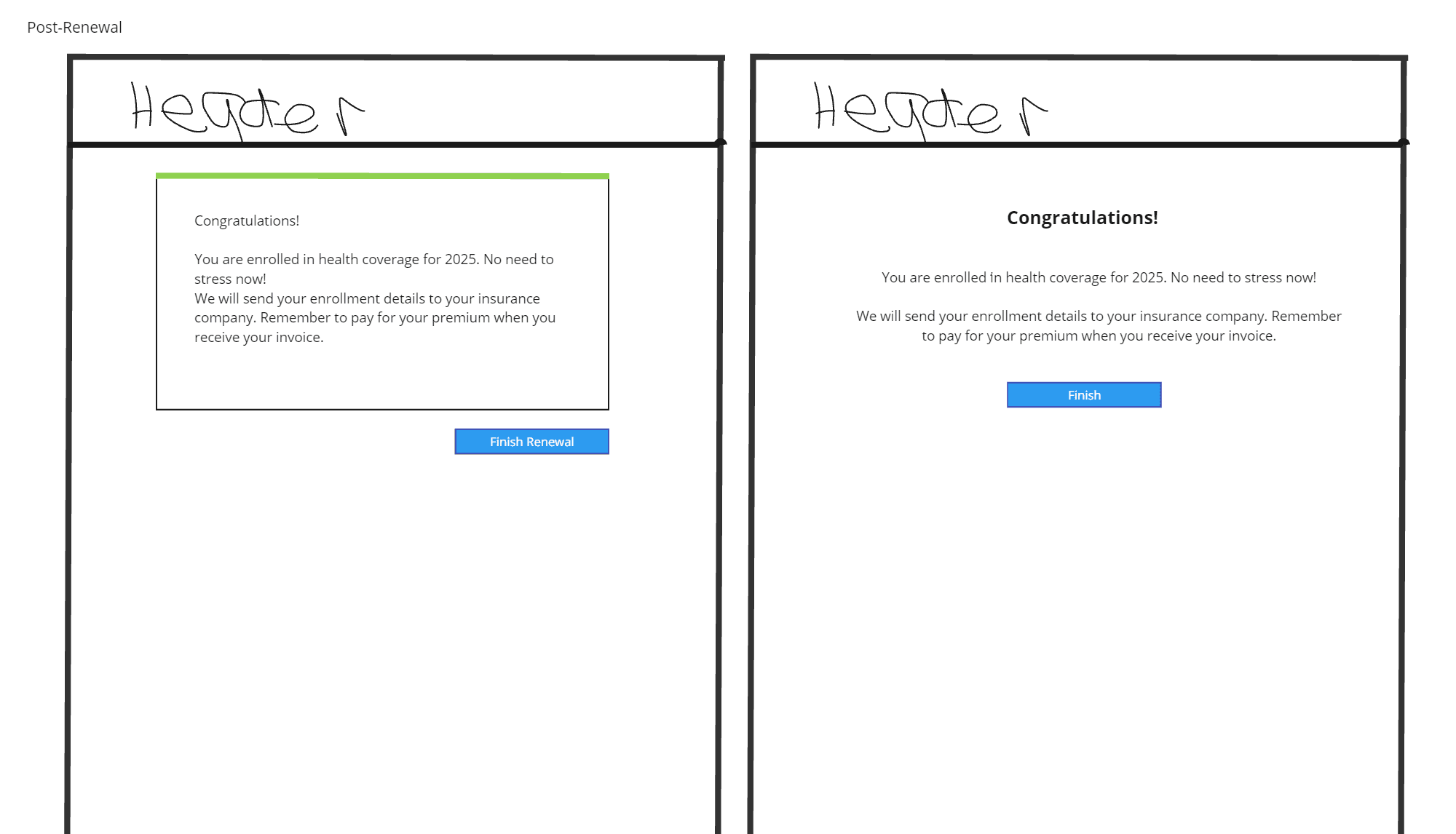
✨ What We Built
A new Angular-based UI for the Renewals experience
A refreshed flow with better structure, more guidance, and built-in messaging
A display of the user's information on file to help them decide whether they needed to update anything, like income or address
A simple but powerful confirmation modal (“Are you sure?”) that prevented over 50,000 mistaken opt-outs
🧩 Our Challenges
This project had a lot of moving parts — technical limitations, legacy UI, and shifting priorities. One moment that stood out: discovering that the “Find New Plan” button caused critical data issues. We couldn’t remove it without losing functionality, but we also couldn’t leave it as-is.
Our compromise: relabel the button as “Shop for other plans,” while keeping the opt-out behavior in the backend. Not perfect — but a strategic tradeoff that reduced risk and met the user need.
Navigating those tensions required empathy, creativity, and collaboration.
👩💻 My Role
As Lead UX Designer, I drove the redesign process from end to end:
Led user interviews and journey mapping to understand renewal pain points
Partnered with product and development teams to define scope and explore constraints
Created wireframes, prototypes, and final UI in Figma
Balanced research-backed advocacy with pragmatic decision-making
Authored flow docs and a detailed nav map to support dev implementation
Completed full UX copy review to ensure tone clarity and reassurance across the experience
This project leaned heavily on my ability to be organized, process-driven, and fluent in both product and user language — especially when tradeoffs were on the table.
📈 The Results
50,000+ users prevented from unintended opt-outs thanks to one simple modal
83% of enrollments in 2025 came from returning customers, indicating that improving the renewal experience has significant business returns
A smoother, faster implementation process due to structured handoff documentation
👩🎓 What I Learned
Collaboration doesn’t mean compromise — it means staying flexible without losing sight of user needs.
In high-complexity projects, a journey map and nav flow doc are essential alignment tools.
Users want certainty. Our job is to surface the right info at the right moment so they don’t have to guess.
🧰 Skills This Project Showcases
✅ Designing with the dev reality in mind
✅ Using strategic storytelling to advocate for users when project scope tightened
✅ Writing content that builds trust in a high-stakes process
✅ Synthesizing user needs into clear, actionable experiences
✅ Organizing chaos with structure, clarity, and purpose
📎Artifacts


Or
if you want to chat!