The Income Verification Beast
How I helped simplify a bureaucratic headache and kept thousands of people enrolled, without making anyone upload a single pay stub.
Role
Lead UX Designer
Timeline
4 Months
Platform
Responsive Web App
🧠 The Mess We Were Untangling
Every year, people applying for health coverage get flagged if their reported income doesn’t match what the federal system expects. When that happens, a scary-sounding email is sent telling them they need to prove their income, usually by uploading documents.
The problem?
Uploading income documents is a pain and it causes delays in coverage.
Most people don’t understand why they’re being asked.
And behind the scenes? Our team had to manually verify every upload. It was slow, expensive, and soul-crushing.
It wasn’t working for anyone — users, brokers, or the business.
The UX team was asked to create a new workflow that would allow users to self-attest to their income—cutting paperwork and reducing call volume, while still meeting strict compliance requirements. What followed was one of the most complex, collaborative, and policy-entangled projects I’ve ever worked on.
💡 Our Big Idea
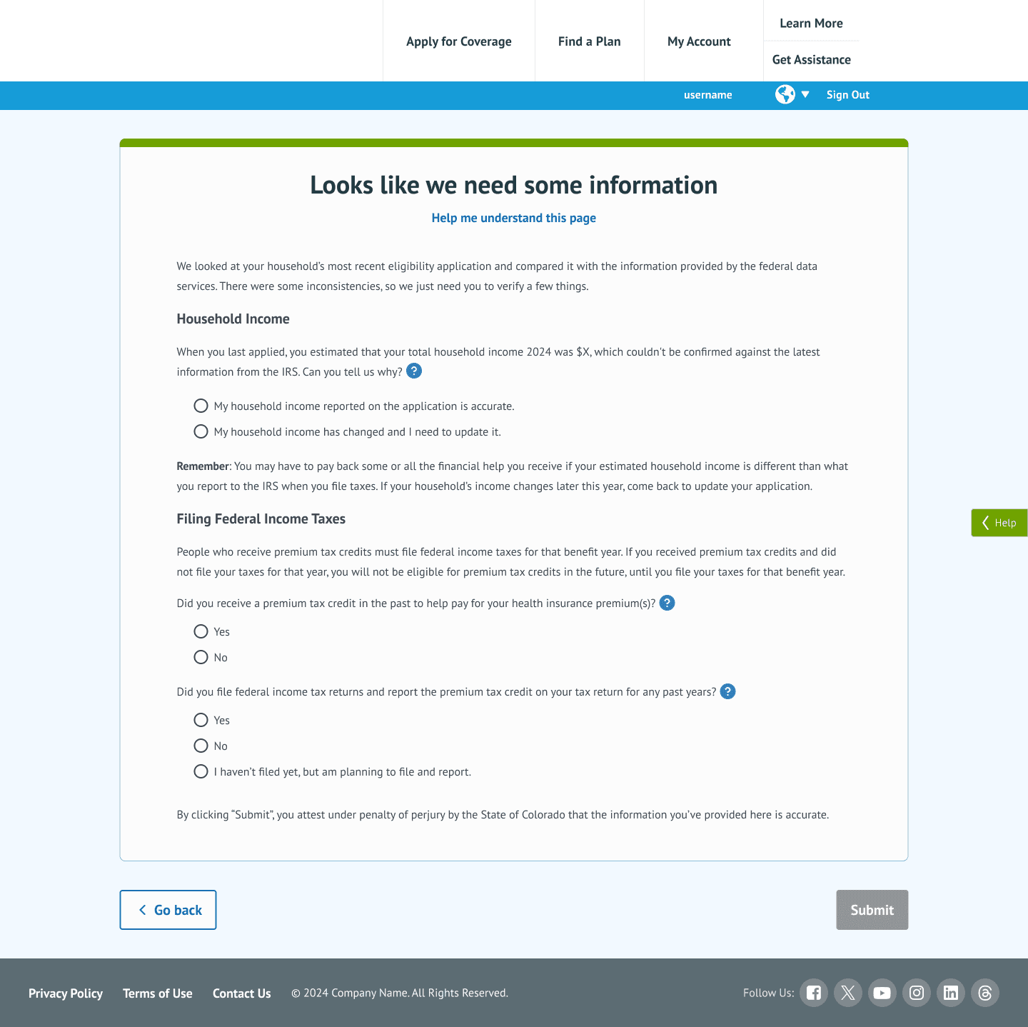
Let users self-attest to their projected income — no documents needed — and close out the issue right there in the application.
Simple in concept. Complex in practice. But the potential payoff? Huge.
✨ What We Built
We designed a new flow where eligible users could attest to their income directly in the app.
A key feature of this flow included a new dashboard for brokers, giving them visibility into which clients had pending verifications, allowing for faster, more proactive help.
🧩 Our Challenges
This wasn’t just a design challenge — it was a language, trust, and bureaucracy challenge.
Legal had strict rules about what we could say.
The flow had to be flexible enough for many edge cases.
Most users were confused and a little scared — we had to make the interaction feel safe, fast, and honest.
Also, the project started without a clear brief. It took time (and a lot of whiteboarding) just to define what success would look like.
👩💻 My Role
As Lead UX Designer, I helped guide this project from ambiguity to execution. My focus was on:
Leading the design and research efforts across multiple iterations — from early concepts to live A/B tests.
Working with product leaders to define scope, constraints, and real-world success metrics.
Partnering with legal and compliance to build flows that passed scrutiny while staying user-friendly.
Gathering insights from brokers, customer support teams, and real users to deeply understand the problem space and pain points.
I served as the connector between cross-functional teams, and made sure that what we designed met user needs, legal standards, and business goals — with the least possible friction.
📈 The Results
83% of applicants with income flags resolved the issue through self-attestation — no documents uploaded.
Despite a 19% increase in enrollment, service center calls dropped 18%.
We saw a 42% decrease in production bugs during Open Enrollment.
The user experience got smoother. The business saved time and money. Support staff were less overwhelmed. Win-win-win.
👩🎓 What I Learned
Business + UX alignment is everything. The clearer the business objective, the faster and more effectively we can design toward it. When that clarity was missing early on, progress stalled.
Legal and policy aren't roadblocks — they’re collaborators. Once we brought them in as true partners, we found creative ways to move fast and stay compliant.
A strong process matters. Keeping feedback organized, stakeholders aligned, and decisions documented made it possible to steer a large, messy project to a clean launch.
🧰 Skills This Project Showcases
✅ Designing under regulatory constraints
✅ Speaking the language of product, policy, and legal
✅ Synthesizing user needs into clear, actionable experiences
✅ Organizing chaos with structure, clarity, and purpose
📎Artifacts
Or
if you want to chat!